Alex and I were in charge of putting the commercial together for our project. I feel like our main goal was to aim it towards elderly people that would be in much need of the help troys company can provide. we decided to do it at his house because it was a small clean and quiet neighborhood. our transition were nice and smooth through each scene so it didn't look to crowded and the way we put it together was very pleasing to the average eye.
Wednesday, April 26, 2017
Monday, February 6, 2017
Design Evaluation
If Dr. Pepper was a real Doctor,
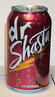
Dr. Shasta is Practicing medicine with no license.
Dr. Pepper
I can say that I probably have an addiction to Dr. pepper and to me nothing else taste exactly what Dr. pepper taste like. Even though it has its a huge brand and very popular around the world I feel like the design isn't to crazy and really grabs my eye. It advertises its 23 different flavors in one single can and the colors of the can to me are soft and pleasing. The typograpghy on the can are a simple, but elegant cursive as if it were a high end drink. And with the white lettering its pops out on the can to grab a person attentions.
Dr. Shasta
Besides knowing this is the generic brand of Dr. pepper I've drank it quite a bit, but the can kills me. The colors are to bland and dark which don't contrast each other . Well all know generic when we see it and I would think if I were to come out with a product like another I would keep it somewhat close knowing the popularity it has. The typography reminds me of stuff you doodled in high school or a sorry excuse for graffiti which does not make me want to purchase this brand. I get the bubbles at the bottom because it's a carbonated soft drink, but what is the lightening bolt at the bottom? I've tried to figure out what it has to do with the drink and nothing comes to mind.
Wednesday, January 25, 2017
Contrast, Harmony, and Balance
This is photo that my girlfriend took of me playing with my drone and my little bro watching me so fascinated with what I'm doing. This photo is so amazing to me because it's another human that wants nothing more then to be/ do what I'm doing. The contrast/aperture is what draws me in. The little boy is the center of attention for with me blurred out in the back ground. He's the younger me and I'm setting a good example and path for him to follow. To me I feel the balance is good because of the angle this was taken and the top of our heads meet perfectly. This was also take at the golden hour for best lighting and held shadows and highlights great. The mini that completes me and know what this photo is the harmony lets people understand the unity between us two and can feel the same feeling that little boy is feeling.
Wednesday, January 18, 2017
Visceral Response
This is a photo I took a few months back of my best friends car, and its one of my all time favorite cars. I chose to take this picture at what they call the golden hour because it's the perfect amount of light when photographing I believe. This picture grabs me because of the angle I got it at. You're able to see more then just the rear end of the car. It's physical features really pull the eye in and the shadows on the paint. I feel having the blue car in front of the red mountain are a complimentary contrast for each other and really make the car pop. The setting provides a background for the car to be center of attention.
Subscribe to:
Posts (Atom)


