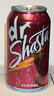
If Dr. Pepper was a real Doctor,
Dr. Shasta is Practicing medicine with no license.
Dr. Pepper
I can say that I probably have an addiction to Dr. pepper and to me nothing else taste exactly what Dr. pepper taste like. Even though it has its a huge brand and very popular around the world I feel like the design isn't to crazy and really grabs my eye. It advertises its 23 different flavors in one single can and the colors of the can to me are soft and pleasing. The typograpghy on the can are a simple, but elegant cursive as if it were a high end drink. And with the white lettering its pops out on the can to grab a person attentions.
Dr. Shasta
Besides knowing this is the generic brand of Dr. pepper I've drank it quite a bit, but the can kills me. The colors are to bland and dark which don't contrast each other . Well all know generic when we see it and I would think if I were to come out with a product like another I would keep it somewhat close knowing the popularity it has. The typography reminds me of stuff you doodled in high school or a sorry excuse for graffiti which does not make me want to purchase this brand. I get the bubbles at the bottom because it's a carbonated soft drink, but what is the lightening bolt at the bottom? I've tried to figure out what it has to do with the drink and nothing comes to mind.

